
The Dirty Secret of AI-Generated Web Design (We Have the Data to Prove It)
A pilot study on design preferences across Claude, Gemini, and GPT, and what it revealed about how humans judge visual quality.
Benchmarks can tell you which model writes the best code. They can't tell you which model makes the best-looking website.
That gap matters more than most people realize. LLMs now generate landing pages, dashboards, and marketing sites, but a model that aces HumanEval might still produce a homepage that looks like a 2008 Wordpress template. There's no standardized way to measure design quality. At Verita AI, we're building the data layer for multimodal AI, from taste-driven datasets and expert evaluations to creative workflows, design evaluation is a problem we think about constantly. So we decided to start measuring it.
We ran a pilot human-preference study: four models, 439 pairwise comparisons, five annotators, 1,260 cleaned votes. Claude Opus 4.5, Gemini 3.0 Pro, GPT-5.2, and GPT-5.2 Codex each generated website designs from the same prompts, and annotators judged them on aesthetic preference, tone fit, domain fit, and prompt adherence.
Design and aesthetics occupy a special corner of agentic AI. You can't simply capture quality with quantitative scores the way you can with code benchmarks or math accuracy (beyond the basics like spacing and load times). The judgments are subjective, contextual, and deeply human. That makes this space both harder and more interesting. This blog is one of our first experiments in an attempt to get a read on the design space and figure out what we're actually looking for.
Our approach was deliberate: cast a wide net, keep an open mind, invite as much freeform response as possible. We gave our annotators structured categories to work with, but also asked them to tell us, in their own words, what they noticed. The hypothesis: structured ratings combined with qualitative feedback would surface both patterns and surprises. It did.
The setup
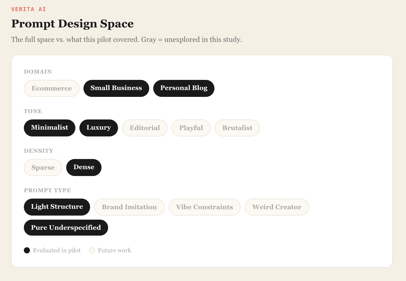
The full design space
We're interested in a broad question: how do models handle the full range of design decisions? To map that space, we defined five prompt dimensions and we scoped down to a deliberate slice for the pilot. This gave us 80 prompt types: enough variety to see real differences, small enough for five annotators to evaluate carefully.
Generation and rendering
Each prompt went to all four models (Claude Opus 4.5, Gemini 3.0 Pro, GPT-5.2, and GPT-5.2 Codex) which generated a single-page HTML file. These are rendered design artificats, not functional websites. We performed minor prompt engineering to enforce clean code, prompt-following behavior, and structured generation, then captured full-page screenshots with a headless Chrome browser. Those screenshots went to our annotation team.
A typical prompt:
Design a minimalist homepage for a personal travel blog. Include a hero title with the blog name, a grid of recent posts with images, an about section introducing the author, and a newsletter signup form. The design should feel clean, modern, and highly readable with generous whitespace.
[Screenshots of all four model outputs for this prompt are shown below.]
GPT 5.2:
GPT 5.2 Codex:

Claude:

Gemini:

Annotation
We started with a group of five annotators who rated their preferences across four categories: aesthetic preference, tone fit, domain fit, and prompt adherence, and wrote freeform explanations of what they noticed. We kept the instructions intentionally loose; the goal was to discover the dimensions people naturally reach for when they evaluate design, not impose our own rubric.
Out of the 1,400 annotations we collected, we filtered for quality by removing responses that were very short or didn't provide information beyond the structured ratings. That left us with 1,260 clean votes across 80 prompt types.
Finding 1: Claude and Gemini are tied overall, but they specialize in different regimes
Overall rankings from our Bradley-Terry model:
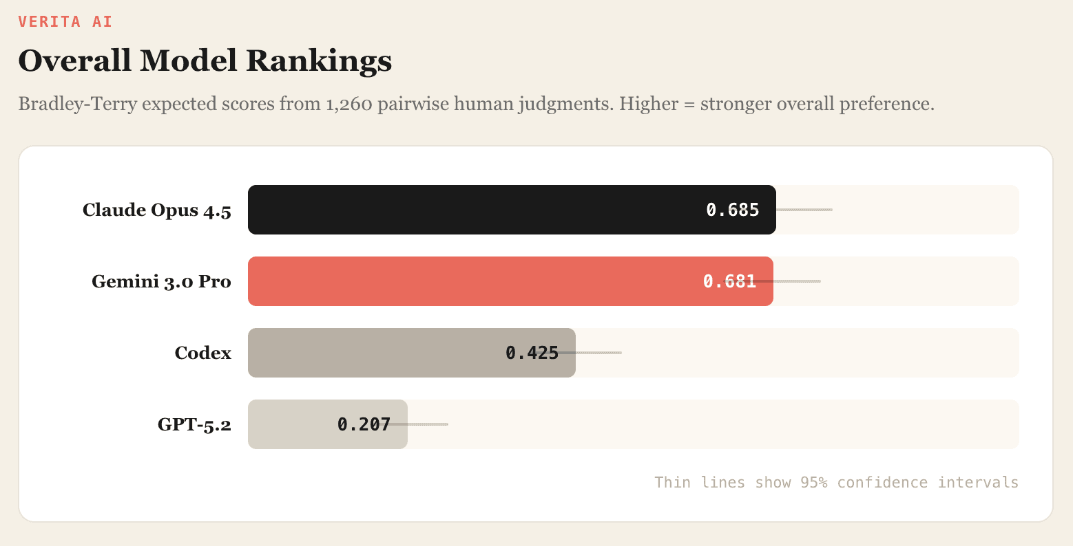
Claude and Gemini are extremely close. In head-to-head matchups:

There's no meaningful difference by either test, but the aggregate hides something. Break results by tone and a pattern emerges: Claude does better on minimalist prompts, Gemini on luxury. They're not equivalent, they're differently specialized. If you're picking a model for design work, the answer depends on what you're designing.
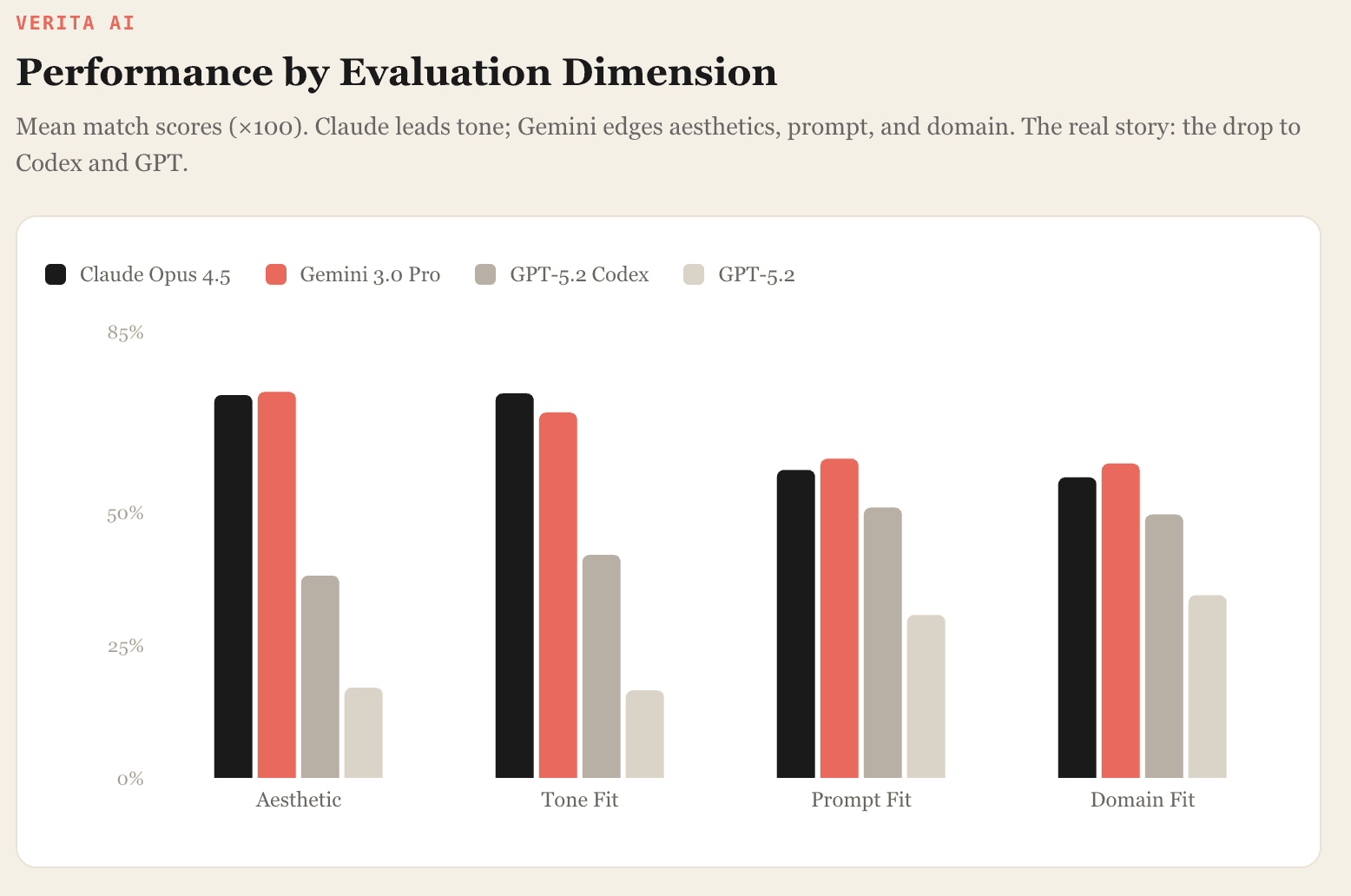
Per-metric breakdown
The mean match scores by metric tell a richer story. A few things jump out. Claude leads on tone fit; Gemini edges ahead on aesthetics, prompt fit, and domain fit. But the gap between them is narrow on every metric. The real story is the drop to Codex and GPT-5.2, and where exactly that drop happens. Codex falls far behind on aesthetics and tone, but it's much closer on prompt and domain adherence. It grasps what to build, even when the output doesn't look good.
Finding 2: Typography is the #1 failure mode, and the gap is enormous
We clustered all freeform annotator responses by theme. These are the dimensions they mentioned most.

The three themes that drove most decisions
Typography. Poor font choices (monospace, "typewriter-like," or otherwise jarring faces) were among the most frequent reasons for rejecting a design. Annotators flagged this consistently across prompts and model pairs.
Layout hierarchy. Spacing, alignment, and visual hierarchy came up almost as often. Annotators used these as the primary signal for which design felt "more polished,” even when both options had similar styling.
Completeness. Designs that left sections empty or half-built got penalized, even when the visual styling was otherwise strong. A beautiful header over a blank content area still lost.
These recurring patterns tell us something: even subjective aesthetic judgments rely on a relatively stable set of design heuristics. Annotators didn't need a rubric to converge on these. They arrived at them independently.
The typography gap by model
Annotators flagged GPT's font choices nearly ten times as often as Claude's or Gemini's. This is the single largest performance gap in the study.

Full failure mode breakdown
Each model has a distinct profile when it loses:
Claude loses most on completeness. Its designs tend to be clean but sometimes too spare - sections left undeveloped, content areas that feel hollow. The visual execution is usually polished; the problem is what's missing.
Gemini has no single dominant weakness. Losses spread across tone and layout, which makes it, in a way, the hardest model to diagnose. There's no obvious lever to pull.
Codex gets pulled down by typography and tone mismatch. Its layout decisions are more competitive, but the visual polish isn't there.
GPT-5.2 shows the same failure modes as Codex, only more severe. Typography and readability issues dominate its losses.
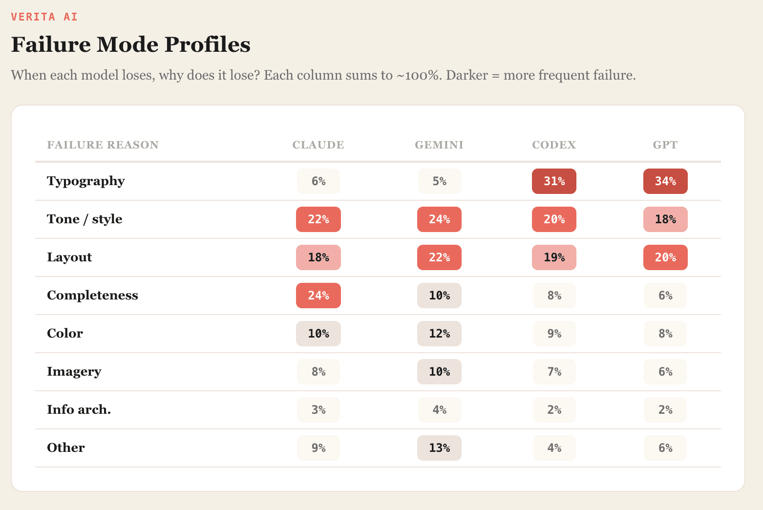
The distribution of losses across different aspects hints at a practical takeaway: the current best approach may be to route different design tasks to the model that handles them best, rather than relying on a single model for everything.
Finding 3: People agree on aesthetics, but not on whether you followed the prompt
We also wanted to understand how consistent design judgments are across annotators. When five people look at the same pair of screenshots, do they pick the same winner?
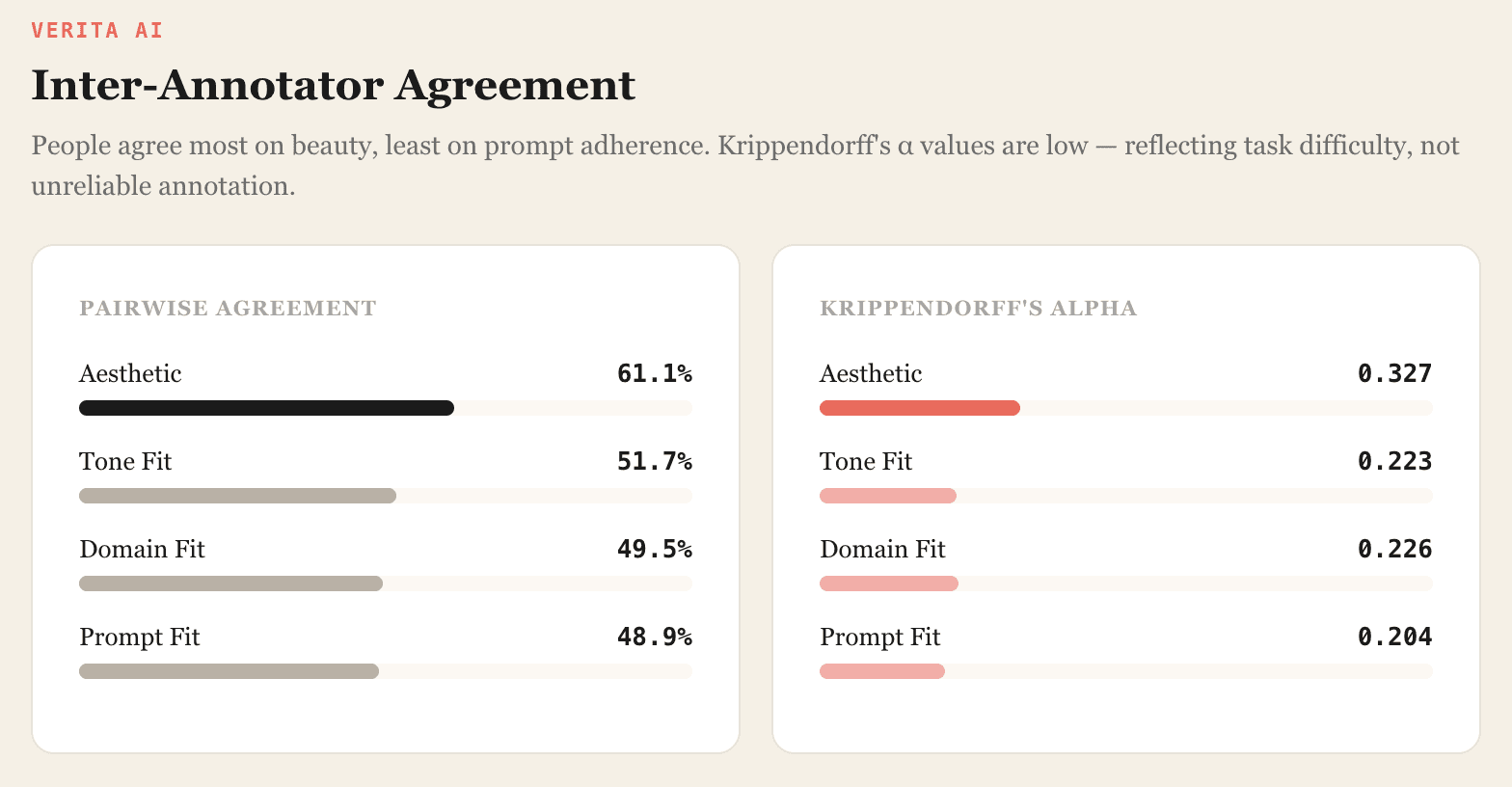
Aesthetics had the most agreement. Prompt adherence and domain fit hovered near a coin flip.
Krippendorff's alpha values are low by the standards of annotation work, and they deserve careful thought.
This doesn't read to us as the annotations being unreliable. It reads as the task being genuinely hard. Our prompts were vague on purpose. "Design a luxury homepage for a small business" leaves enormous room for interpretation. What counts as luxury? What kind of business? Two competent annotators can look at the same screenshot and disagree, because they're evaluating against different internal standards.
Design judgments combine multiple factors: visual taste, interpretation of the prompt, expectations about domain conventions, assumptions about what the model was trying to achieve. Without careful calibration, annotators end up applying different internal criteria to the same design.
The upshot for anyone building a design evaluation pipeline: aesthetic preference is your most stable signal. Prompt adherence, arguably the dimension a developer cares about most, is the hardest to get agreement on. A serious design benchmark needs calibration protocols that separate these dimensions and give annotators concrete reference points rather than raw intuition.
Rather than viewing this as a flaw, we see it as one of the most useful findings in the study. It tells us exactly where the evaluation methodology needs to improve, and it tells us that the rubrics themselves are as important as the data they produce.
Limitations
We want to be upfront about what this study does and doesn't cover.
This is a pilot. It evaluates only a narrow slice of the prompt space: dense layouts, two tones (minimalist and luxury), two domains (personal blog and small business). The full design space, including editorial, playful, and brutalist tones, ecommerce, sparse layouts, brand imitation prompts, remains unexplored.
Our evaluation is based on rendered screenshots, not full website implementations. We did not assess accessibility, responsiveness, or runtime performance. Those dimensions matter for production use and are outside the scope of this study.
Five annotators is a small team. The inter-annotator agreement analysis is informative but would benefit from a larger pool. Future iterations will expand annotator count, refine evaluation rubrics, and increase calibration.
What we take from this
The headline isn't which model "won." It's that design judgments, even messy and subjective ones, converge on a small set of concrete principles. Typography, layout hierarchy, tone alignment, completeness. Those four themes account for the bulk of annotator reasoning across all 1,260 votes. That consistency gives us something to build on.
Picking a design model isn't about crowning a single champion. Claude and Gemini are both strong, but in different ways and on different prompts. The question that matters is which design regime you're working in, and that's a question standard benchmarks don't even try to answer.
What comes next
Sharper evaluation rubrics. The agreement numbers tell us where to focus. We're developing structured criteria that separate: visual polish and typography; layout hierarchy and spacing; completeness of page structure; alignment with the intended tone. Each dimension will have reference examples and concrete scoring anchors. The goal isn't to squeeze subjectivity out of design judgment, it's to make that subjectivity consistent enough to become a useful training signal.
Broader prompt coverage. Minimalism and luxury across two domains is a start. We're expanding to editorial, playful, and brutalist tones, adding ecommerce and more domain types, and varying layout density between sparse and dense. The full design space is large, and we expect the model rankings to shift as we move through it.
Data that closes the gap. Everything we're learning feeds directly into what Verita AI exists to do: build high-quality human preference datasets for multimodal AI. Design is one of several domains where standard benchmarks miss what matters. We're applying the same approach to music, video, marketing, enterprise software, and creative workflows: anywhere the distance between "technically correct" and "actually good" is wide enough to matter.
We're early in this work, and we know it. Aesthetic preference is a space where we don't have all the answers yet; what we have is a methodology for asking better questions, and a growing body of evidence about what those questions should be. In the coming weeks and months, we'll continue developing techniques to make aesthetic preference data more useful, more objective, and more actionable.
More to come. If you're working on design generation, evaluation methodology, or multimodal preference data - let's talk.
This study was conducted by the Verita AI research team. Questions about methodology or data access: research@verita-ai.com.